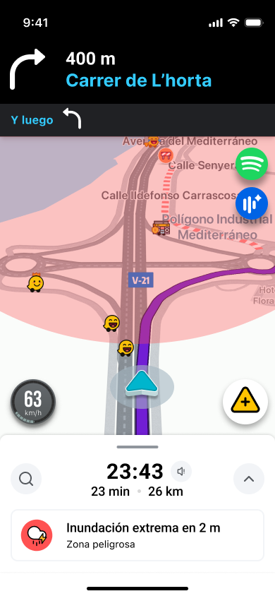
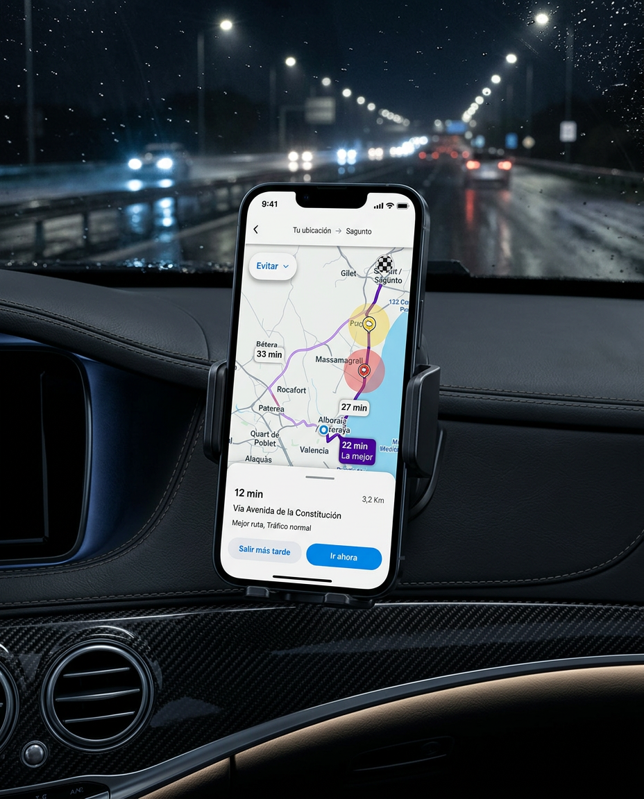
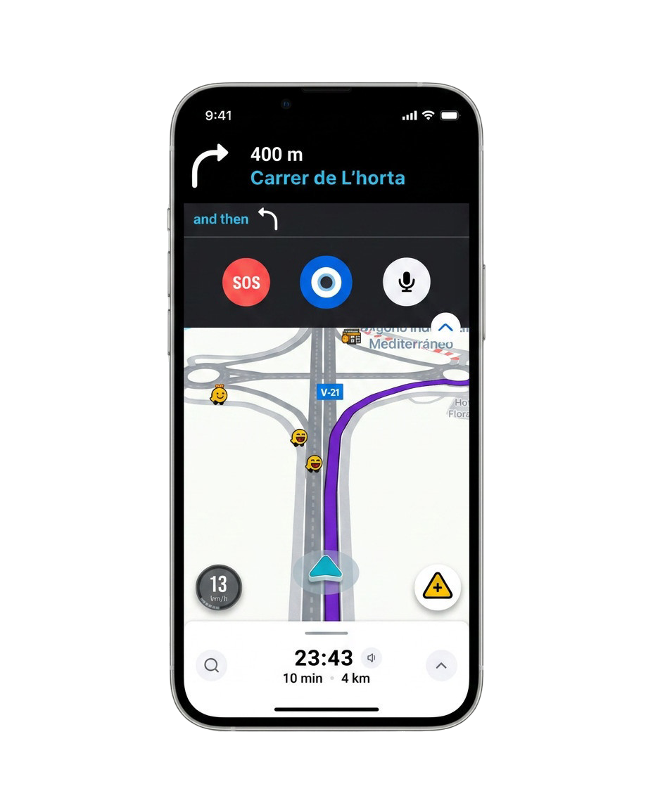
A road safety concept for Waze that surfaces severe weather and road closures, proposes safer routes and supports emergency assistance when needed.
The navigation apps people use most may not always surface rain, snow or road closures early enough. Drivers often learn about the risk only when they are already facing it.
// Starting hypothesis — Master's in Design Thinking and UX/UI Design
From that hypothesis, the work split into three areas: how competitors communicate road risk, how Argos could fit within an established product, and which drivers to design for.
Reviewed how Waze, Google Maps and weather/emergency apps communicate road risks, identifying useful patterns and potential gaps.
Argos was conceived as a Waze-integrated module, using familiar navigation patterns without simply copying the existing interface.
Focused on frequent drivers, including professional drivers and regular travelers, while considering everyday road users.
Key problems identified in current navigation apps around risk alerts. That diagnosis became the design brief for Argos.
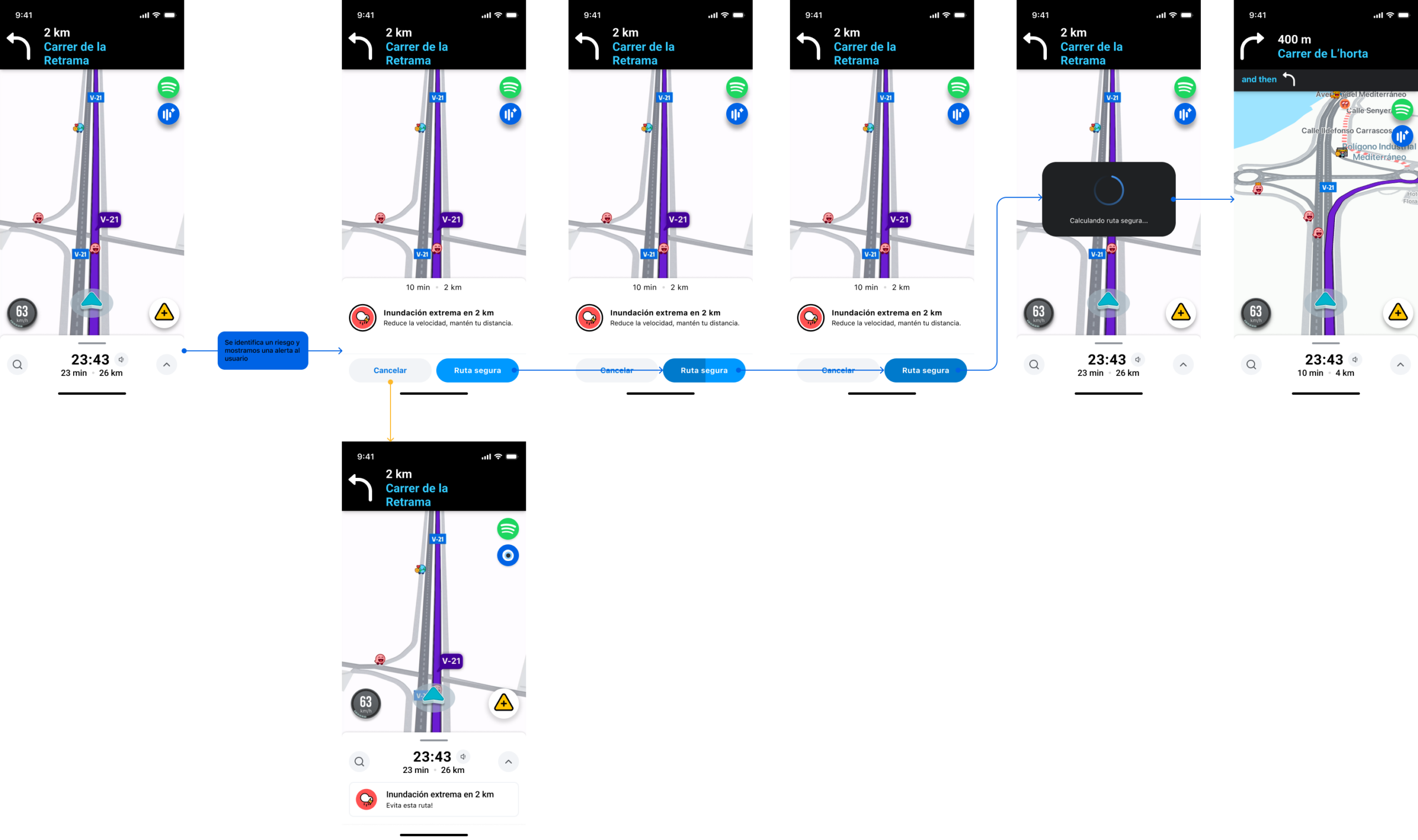
The team inherited an initial UX foundation from an earlier group. My work focused on auditing those flows, identifying friction and redesigning how critical alerts appear within the driving experience.
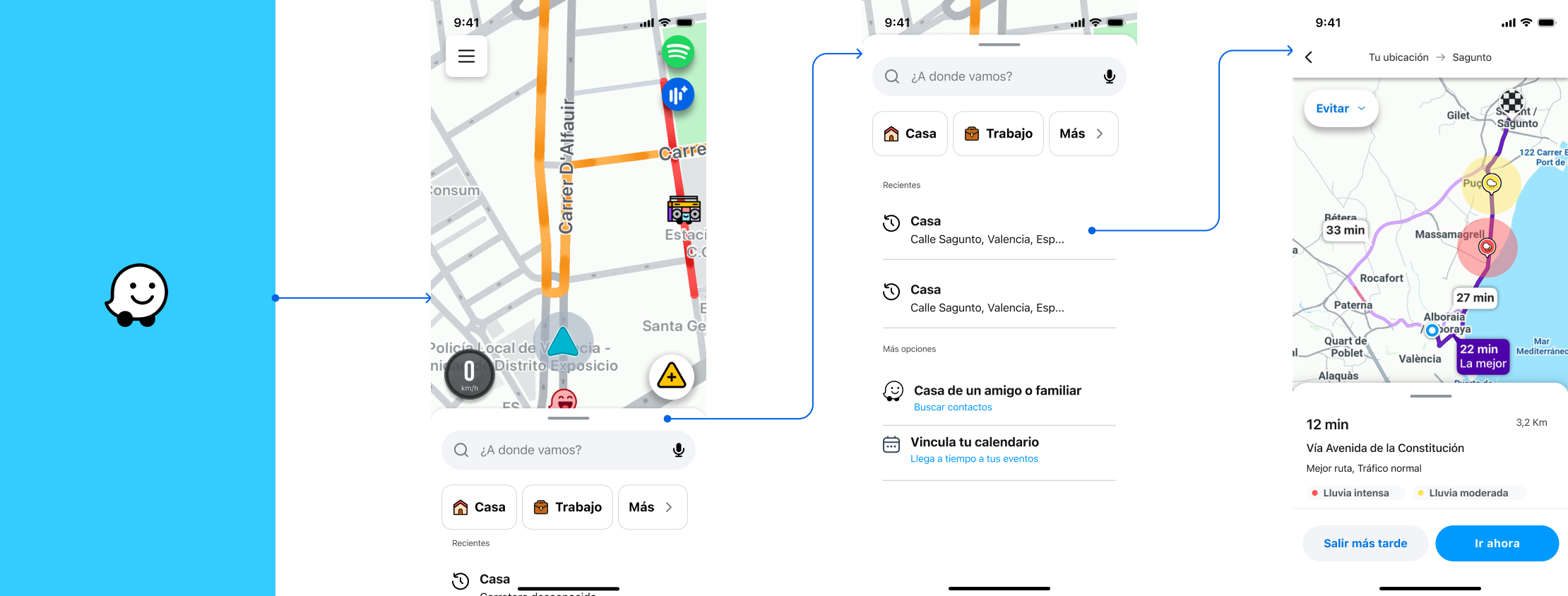
Recent routes, shortcuts, linked calendar and weather context before departure.
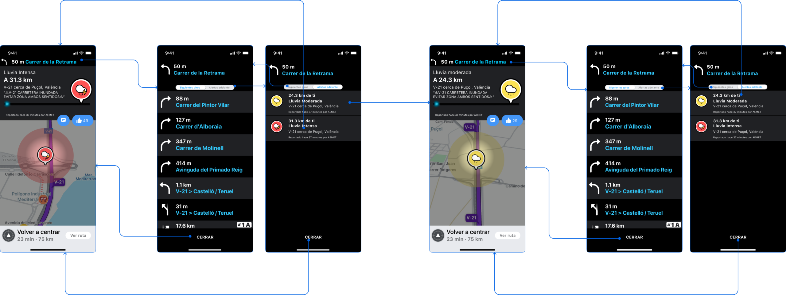
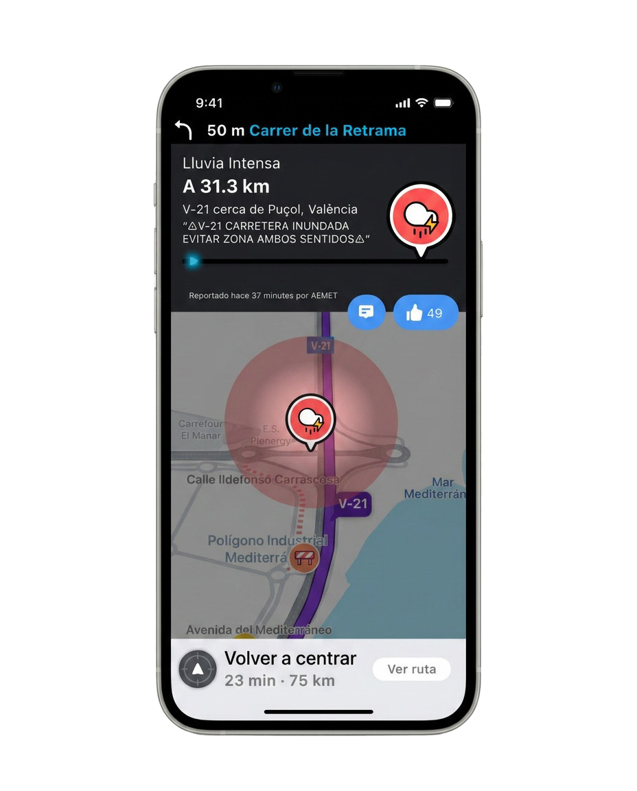
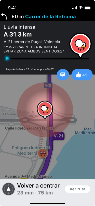
Risk type, distance, source and recency shown without losing route context.
A concept flow for high-impact hazards, speed guidance and alternate routes.
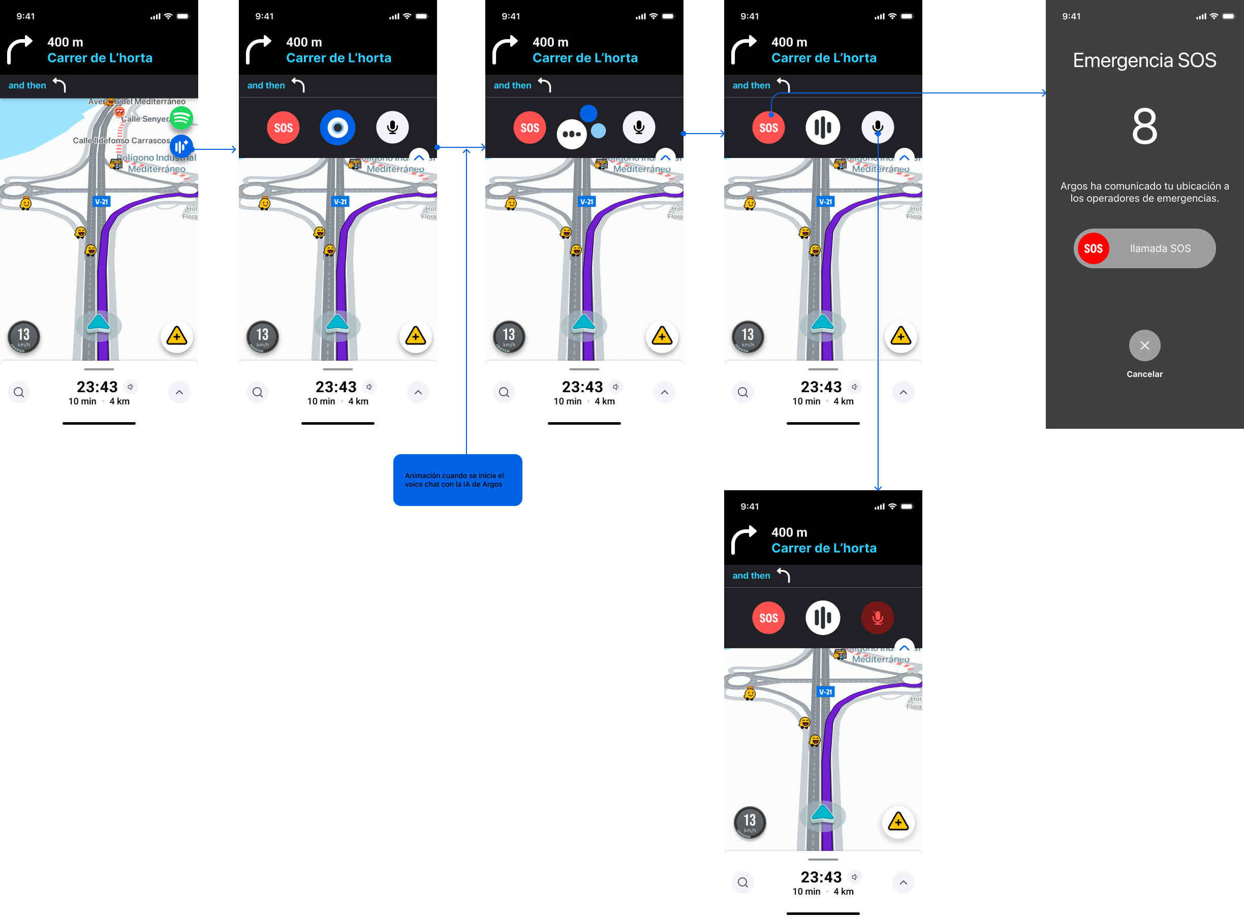
A proposed emergency interaction that shares location as part of the call flow; not a deployed service.
An overlay with SOS, voice and hazard-reporting controls integrated into navigation.
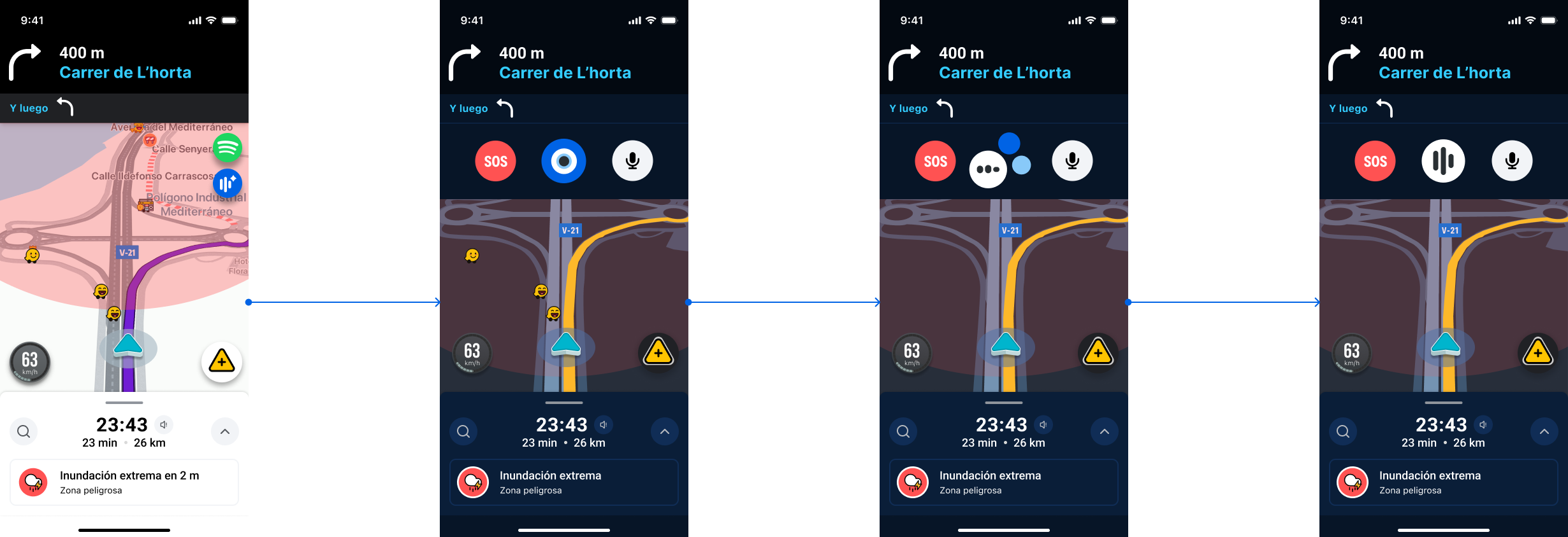
With flows locked, the team defined Argos's art direction: a visual system that lives alongside Waze without cloning it—keeping map conventions while making hazards instantly recognizable.
SOS. Maximum contrast and a single action color so requesting help does not require thinking.
Argos mode. Hazard-area overlay on the Waze map in night mode, without covering the route.
From research to the final prototype, this was my path within the team.
Competitor benchmarking, brand analysis and Waze integration fit, and definition of the user persona.
Audit and redesign of the five key flows to reduce friction and cognitive load while driving, building on a foundation inherited from an earlier team.
As a group we defined the design system: color palette, typography, iconography and alert components integrated within Waze.
Layout of the final screens and prototyping of the full flow in Figma, from trip start through alert resolution.
No commitment. Just a conversation to see if we are a fit.
Get in touch ↗